Inktober 52 - 2021 20
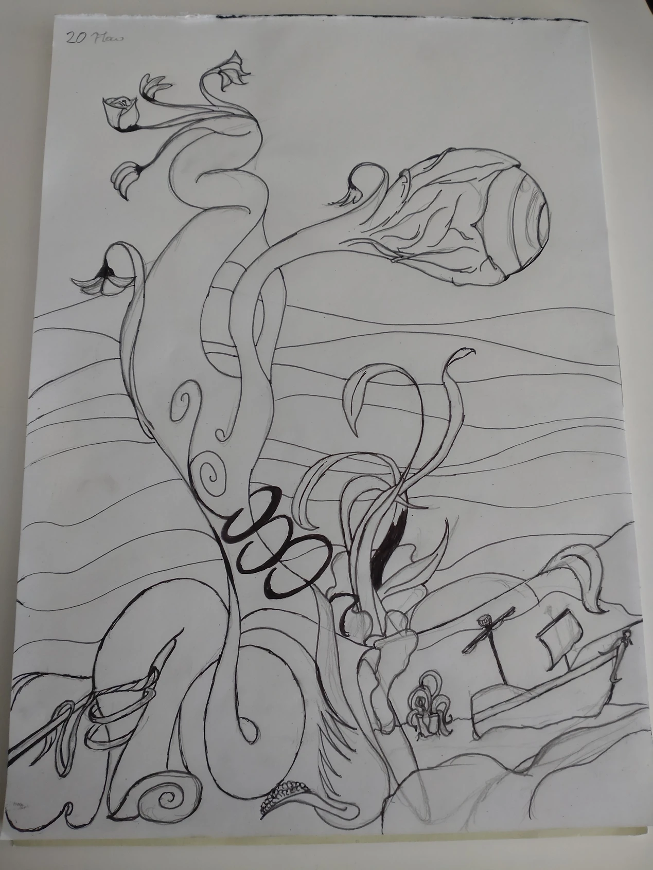
I have to admit, I've had a few problems with this prompt. The drawing part was relatively straight forward, once I knew what I wanted to do for the prompt, but things I'd normally associate with flow, I'm just straight up unable to even sketch. With the set of hobbies I have, the concept of flow, if not taken literally, it'll involve me either doing math at 2 in the morning, or playing an instrument. Since I can't make the idea of doing math very visually stimulating, and my anatomy is still too garbage to render a person playing an instrument, I had to default to using flow in its literal meaning. It's not technically anything I've never done before, since a lot of the rough sketches I've done in smaller scrap-books on the go have been flowy shapes, since they're easy to draw, but still technically improve your line-work, if you do enough of them. So this time I was going to use those flowy shapes as a basis to do a water scene. That counts as a flow, right?
I started with the stem of the eyeball-plant looking thing. I hadn't planned for it to be an eyeball-plant, that was mainly a decision made to fill up that quadrant of the page, and not wanting to add another plant. Genuinely, I think that would've made it too crowded on the center right. I decided not to use reference at all for this one, even though clearly I don't know underwater plants very well - nor most plants to be perfectly honest. I know seaweed, mainly because it's great in soup, but that's about it. I think that's why I elected to add flowers to the eyeball-plant.
The ship in the bottle was an impromptu addition, made because I thought it might add a nice touch. It's supposed to be propped up by a rock or two. I wonder, whether that's going to come across, when I'm done.
So, a couple of old habits ran away with me, when I made the pencil sketch. Those rings running up the eyeball-plant were added, though I never really thought about what I was doing. It's terrible geometry, really, which I never technically planned on adding, but I figured since there were there, and they do fill the space nicely, they were allowed to stay. This time. The ship maybe came out a little simplistic, but as long as it's recognizably a ship, I'll be happy. At this point I'm kinda worrying about the shading. I might not have put enough thought into where the spaces intersect, considering this was basically a freebie. No anatomy, no clothing and such... There's also a could of tangents, which probably shouldn't have been there, since that makes the disparate elements difficult to read. Well, shapes have been inked, so no changing that now. It just occurred to me, because I didn't notice them, when I did the sketch, nor when started to ink.
Light-source comes from above, after all, we're on the ocean floor - well, supposed to anyway. Not that there's light there, usually, but let's say a submarine is implied. The eyeball characteristic has been mostly obscured, which I'm mostly fine with. I don't think black inks are technically a good tool to express irises against the pupils. The ship came out okay, though I suppose that one could have used some reference material. Generally, the glass bottle, isn't very readable as a glass bottle, which might be something about the most characteristic part of the shape being just out of frame. The light fracturing of the object is also very close to the outer border of the bottle, which would imply a very thin glass bottle, now that I think about it. I wonder whether a clearer break might remedy the issue. I guess this one was more about the atmosphere than it was about technique. Maybe next week will be something more geared towards practice. If anything, I think this highlights what I do, when I'm not thinking about composition, not all of it is necessarily great. I managed to save some of the tangents with the shading for example, but maybe it'd be better, if I avoided them in the line-art as well.


