November 2023: Colour Theory
I enjoy sketching, but I don't do colour. I don't do colour so intensely that I barely wear it. Not because I don't know which ones I like, but it's more that I'm (very likely, I don't actually know) terrible at coordinating it. In honesty, I like my wardrobe, so I'm not likely to change it anytime soon, but if I ever want to evolve artistically, I should at least think about working with colour. Because I was also trying to write a novel this month, this exploration is going to be theoretical first here, and maybe it'll worm its way into my art sooner or later. It'll also help with my writing, more specifically character descriptions. Readers of any of my stuff might have noticed that I am very sparing with physical descriptions of people and their wardrobes - especially their wardrobes - which is partially because I have difficulty picturing well put-together outfits. That will have to change sooner or later, if only so I can say something out of left field about plaid.
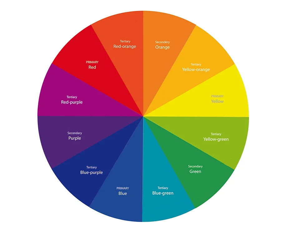
The physics of colour comes down to wavelengths, and I don't really want to get into it, mainly because as a physicists we only really see red (~800 nm) or blue (~400 nm), or very occasionally green (~600 nm), and the exact rainbow spectrum doesn't really get me anywhere in a world where pastel colours, for example, are a thing. At the same time, I'm not really looking to code shaders (at least not now), so whether I'm using RGB or HSC doesn't really matter too much to me at the moment. If you're interested, I'd recommend this video, which goes into a lot of detail regarding the classification and optimization as to why we use the systems we use to display colour. More central to me is going to be common palettes, harmonies and maybe some of that slightly esoteric symbolism stuff, since collective consciousness does play a role in how a piece of art is read. Like last month's theory, this, too, is often mapped on a circular thing. I'm of course referring to the colour wheel, conceived by Isaac Newton and consisting of 12 basic colours, which are three primary and secondary colours, and six tertiary one.
Colours are often prescribed a temperature, often as "undertones". I personally can't really tell whether a colour is supposed to be warm, especially whether an undertone is supposed to be warm. Supposedly it's derived from the reflected colour of an "ideal emitter" under a light source that includes a certain amount of black body radiation. As such, it's really primarily a quantity derived from lighting, rather than the colour itself. Generally, almost all models that give rise to a colour-wheel will feature a line that can be drawn to separate warm tones from cold ones, often with blue and red on its perpendicular. Temperature of undertones is usually mixing a warm or cold colour to the neutral.
There's usually a distinction made between primary, secondary and tertiary colours. The primaries are, of course, red, green and blue, as those are the wavelengths that our eyes are most adjusted to separate. Mixing any two of the three will create the secondary colours (Magenta, Yellow, Cyan) and tertiary colours are made from mixing a primary and a secondary colour. While we think of these as colours, this only describes a way to get the pure form, the "Hue". The "Value" is describes how much white/black/gray is added to the "Hue"-state. Because these create the variations of the same colour on the colour-wheel, the distinction between "Shade" and "Tint" as states where black or white is added is important. If both (or gray) is added, it's referred to as "Tone". "Chroma" is the level of saturation of the Hue colour.
The colour wheel is handy as a tool, since one can simply draw shapes within it to make up the basic colour harmonies. Most charts I found look a little bit like this:

Monochromatic colour harmony is pretty much what it sounds like, but it sounds to me like a harmony made entirely out of octaves, if that makes sense. Besides, seeing as grayscale is technically a form of monochromaticism, I'm already working plenty with it. The next step up is taking two complementary colours, so ones on opposite sides of the wheel. It's the theoretical "maximum difference" between any two families of colours, which will make the contrast very legible, though maybe a little garish. Triadic harmonies - ones created by placing a perfect triangle in the circle - face a similar problem.
Analogous colours are three adjacent ones on the wheel. These are often basically the same colour, so while the scheme will look very rounded and defined, it can descend into noise, if the colours are used at equal distributions. It's recommended to use a dominant (usually the center one) and supporting colour, which are then topped off by a sparingly used accent. One could flip the dominant colour to its complementary and create a split-complementary harmony, which similarly needs to be balanced for the sharp contrast.
A square harmony does what it sounds like on the wheel, though this time we have two complementary pairs. Usually one is chosen to be dominant, while the rest are support. Tetradic are a slight alteration that uses a rectangular, but not square scheme, which automatically relates two colours because of their proximity.
There is usually an emphasis on colour whenever any piece of media is analyzed. That makes sense, since it's easy to place in the background, makes up shot compositions and is definitionally impossible to ignore. That said, I've never really managed to keep associations beyond the obvious and political in mind, and since I don't think I'll be able to work that aspect into any other context, I'll write up a table here, then transition it into my flashcard system, which helped get the the Tarot stuff into my head as well. To me, these things are somewhat the same anyway.
Red: passion, physical energy, warmth, aggression, danger
Yellow: happiness, creativity, mental stimulation, impatience, cowardice
Blue: calmness, honesty, trust, stability, responsibility
Orange: spontaneity, adventure, dynamism, warmth, exhibitionism, superficiality
Green: growth, freshness, harmony, prosperity, enviousness, greediness
Purple: spirituality, imagination, mystery, royalty, wisdom, immaturity
Pink: unconditional love, sympathy, femininity, comfort, playfulness, childishness
Brown: strength, dependability, warmth, honesty, predictability, loneliness
Black: power, elegance, mystery, formality, authority, fear, pessimism
White: purity, innocence, delicacy, cleanliness, coldness, unfriendliness
Gray: neutrality, wisdom, intellect, seriousness, boredom, depression